범주별 구성 비율을 원형으로 표현한 그래프이다. Pie Chart의 특징은 다음과 같다.
- 차원별로 측정값의 비중을 보여주기 위한 목적으로 사용
- 전체 측정값의 합을 360도(비율: 100%)로 정의하고 차원의 구분값에 따른 측정값의 비율에 맞춰 각 영역의 파이 차트 각도를 표현
- 부채꼴의 중심각을 구성 비율에 비례한다.
# matplotlib 라이브러리 불러오기
import matplotlib.pyplot as plt
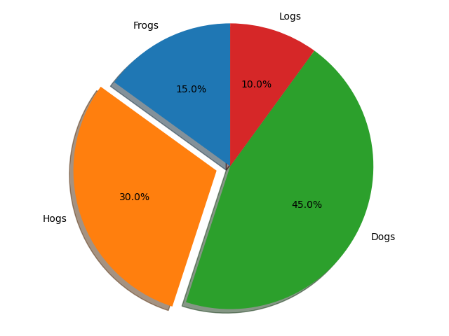
# 원형 차트: 슬라이스가 시계 반대 방향으로 정렬되고 플롯된다.
labels = 'Frogs', 'Hogs', 'Dogs', 'Logs'
sizes = [15, 30, 45, 10]
explode = (0, 0.1, 0, 0) # 부채꼴이 파이 차트의 중심에서 벗어나는 정도 설정
fig1, ax1 = plt.subplots()
ax1.pie(sizes, explode=explode, labels=labels, autopct='%1.1f%%',
shadow=True, startangle=90)
ax1.axis('equal') # 가로 세로 비율이 같으면 파이가 원으로 그려진다.
plt.tight_layout()
plt.savefig('basic_pieplot.png')
# 라이브러리 불러오기
import numpy as np
import matplotlib.pyplot as plt
# 플롯 지정
fig, ax = plt.subplots(figsize=(6, 3), subplot_kw=dict(aspect="equal"))
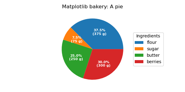
# recipe data 생성
recipe = ["375 g flour", "75 g sugar", "250 g butter", "300 g berries"]
# recipe data를 data와 label로 분류
data = [float(x.split()[0]) for x in recipe]
ingredients = [x.split()[-1] for x in recipe]
# 절대값을 표시하여 자동 백분율 레이블 지정을 확장하는 함수
def func(pct, allvals):
absolute = int(np.round(pct/100.*np.sum(allvals)))
return "{:.1f}%\n({:d} g)".format(pct, absolute)
# pieplot 그리기
wedges, texts, autotexts = ax.pie(data, autopct=lambda pct: func(pct, data),
textprops=dict(color="w"))
ax.legend(wedges, ingredients,
title="Ingredients",
loc="center left",
bbox_to_anchor=(1, 0, 0.5, 1))
plt.setp(autotexts, size=8, weight="bold")
ax.set_title("Matplotlib bakery: A pie")
plt.tight_layout()
plt.savefig('pieplot_label.png')
# 라이브러리 불러오기
import matplotlib.pyplot as plt
from matplotlib.patches import ConnectionPatch
import numpy as np
# figure 생성 및 축 지정
fig, (ax1, ax2) = plt.subplots(1, 2, figsize=(9, 5))
fig.subplots_adjust(wspace=0)
# pie chart 매개변수 지정
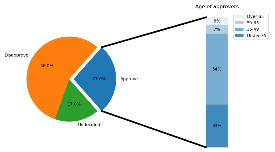
overall_ratios = [.27, .56, .17]
labels = ['Approve', 'Disapprove', 'Undecided']
explode = [0.1, 0, 0]
# rotate so that first wedge is split by the x-axis
angle = -180 * overall_ratios[0]
wedges, *_ = ax1.pie(overall_ratios, autopct='%1.1f%%', startangle=angle,
labels=labels, explode=explode)
# bar chart 매개변수 지정
age_ratios = [.33, .54, .07, .06]
age_labels = ['Under 35', '35-49', '50-65', 'Over 65']
bottom = 1
width = .2
# 범례 표시 설정
for j, (height, label) in enumerate(reversed([*zip(age_ratios, age_labels)])):
bottom -= height
bc = ax2.bar(0, height, width, bottom=bottom, color='C0', label=label,
alpha=0.1 + 0.25 * j)
ax2.bar_label(bc, labels=[f"{height:.0%}"], label_type='center')
ax2.set_title('Age of approvers')
ax2.legend()
ax2.axis('off')
ax2.set_xlim(- 2.5 * width, 2.5 * width)
# 두 그림 사이에 선 긋기
theta1, theta2 = wedges[0].theta1, wedges[0].theta2
center, r = wedges[0].center, wedges[0].r
bar_height = sum(age_ratios)
# 상단 연결선 그리기
x = r * np.cos(np.pi / 180 * theta2) + center[0]
y = r * np.sin(np.pi / 180 * theta2) + center[1]
con = ConnectionPatch(xyA=(-width / 2, bar_height), coordsA=ax2.transData,
xyB=(x, y), coordsB=ax1.transData)
con.set_color([0, 0, 0])
con.set_linewidth(4)
ax2.add_artist(con)
# 하단 연결선 그리기
x = r * np.cos(np.pi / 180 * theta1) + center[0]
y = r * np.sin(np.pi / 180 * theta1) + center[1]
con = ConnectionPatch(xyA=(-width / 2, 0), coordsA=ax2.transData,
xyB=(x, y), coordsB=ax1.transData)
con.set_color([0, 0, 0])
ax2.add_artist(con)
con.set_linewidth(4)
plt.tight_layout()
plt.savefig('bar_of_pie.png')