시계열 데이터를 히트맵으로 표현하는데 사용하는 라이브러리이다.
pip install calmap
calmap을 통해 다음과 같은 깃허브의 Contribution 그래프를 그릴 수 있다.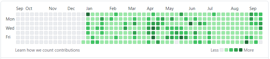
DatetimeIndex가 있는 Pandas 시리즈로 가중치 이벤트가 있다고 가정한다.
# 필요한 라이브러리 가져오기
import numpy as np
import pandas as pd
import matplotlib.pyplot as plt
import calmap

# 시드 설정
np.random.seed(sum(map(ord, 'calmap')))
700일 동안 임의의 날짜에 할당된 임의의 부동 소수점 값으로 500개의 이벤트 데이터를 생성한다.
# 데이터 생성
all_days = pd.date_range('1/15/2014', periods=700, freq='D')
days = np.random.choice(all_days, 500)
events = pd.Series(np.random.randn(len(days)), index=days)
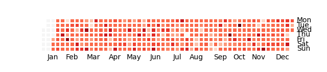
# 기본적으로 yearplot은 첫번째 연도를 표시하고 하루의 값을 합산한다.
year = calmap.yearplot(events)
year.figure.savefig('yearplot.png')
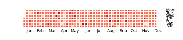
# year 인수를 통해 어떤 연도를 표시할지 선택할 수 있다.
# 2015년에 대한 calendarmap 표현하기
year_2015 = calmap.yearplot(events, year=2015)
year_2015.figure.savefig('yearplot_2015.png')
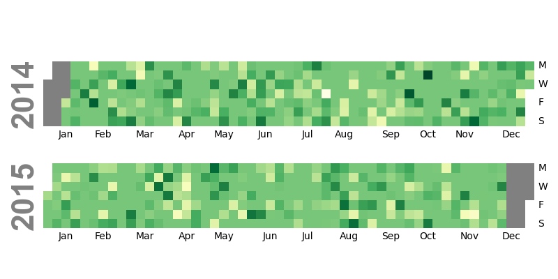
# calendarplot을 사용하여 모든 연도에 대한 데이터를 표시할 수도 있다.
# 2014년과 2015년의 데이터 calendarmap으로 표현하기
calendar = calmap.calendarplot(events, monthticks=3, daylabels='MTWTFSS',
                    dayticks=[0, 2, 4, 6], cmap='YlGn',
                    fillcolor='grey', linewidth=0,
                    fig_kws=dict(figsize=(8, 4)))
plt.tight_layout()
plt.savefig('calendarplot.png')